How to Organize a Website
So visitors find information quickly
Your website is often the first place potential customers learn about your business. But if visitors can't find what they're looking for in seconds, they'll leave-and you'll lose the sale.
The good news? A well-organized website isn't complicated. It's about making smart choices upfront: clear navigation, logical page structure, obvious calls to action, and content that answers the questions people actually have.
Here's how to organize your site so visitors spend time with you, not searching for an exit button.
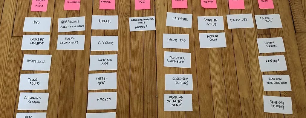
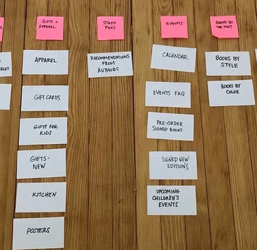
1. Design Navigation That Speaks for Itself
Your main navigation is the roadmap. If visitors are confused by it, they're confused about your business.
What to do:
Keep it short. Aim for 4-7 main menu items. More than that overwhelms people and buries important pages.
Use plain language. Avoid jargon and clever names. "Services" beats "Solutions." "About Us" beats "Our Story" (unless storytelling is literally your brand).
Put the most important pages first. If you sell something, "Products" or "Services" should come before "Blog." If you want inquiries, put "Contact" near the front-don't hide it in the footer.
Organize submenus logically. If you offer multiple services, group related ones under a single dropdown. A plumber might have "Services > Repairs, Installations, Maintenance" rather than five separate menu items.
Make contact information visible. A phone number, email, or "Get in Touch" link should be easy to spot-ideally in the header or top of the page.
Why it matters: People scan. They don't read. A clear, concise menu lets them find what they need in milliseconds instead of minutes.
2. Build a Strong Page Hierarchy
Not all pages are equally important. Your hierarchy should reflect what actually drives your business.
The typical structure:
Homepage - Your welcome mat. It should clearly answer: "What do you do?" "Who is this for?" and "What's my next step?"
Main service/product pages - Deep dives into what you offer. These should be easy to reach from the homepage and navigation.
About page - Why you exist, what makes you different, and why people should trust you.
Contact/inquiry page - Make this page a breeze to find. People who are ready to reach out shouldn't hunt.
Supporting pages - FAQ, testimonials, blog, policies. These are helpful but secondary.
What to do:
Limit your main pages to 5-8. Everything else should be accessible but not cluttering the main navigation.
Link main pages from your homepage. If a visitor lands there, they should see clear paths to your top 3-4 pages.
Use breadcrumbs on deeper pages so visitors know where they are and how to go back.
Why it matters: A clear hierarchy guides visitors toward the pages that matter most-the ones that convert.
3. Organize Your Homepage to Answer the Big Questions Immediately
Your homepage has seconds to convince someone you're worth their time.
The layout that works:
Hero section (top) - A headline and subheading that answer "What do you do?" Use a background image, video, or simple graphic. Keep text short and punchy.
Value proposition (second) - In 2-3 sentences, explain why visitors should care. What problem do you solve? What's different about you?
Services or products (third) - Show your top 3-4 offerings. Use icons, images, or short descriptions. Link each to its full page.
Social proof (middle) - Customer testimonials, reviews, or logos of brands you've worked with. People trust what others say more than what you say.
Call to action (prominent) - A button or section asking for the next step: "Schedule a Consultation," "Get a Quote," "Start Free Trial." Make it stand out.
FAQ or objections (near bottom) - Answer common questions. This builds trust and reduces friction before someone reaches out.
Final CTA (bottom) - Don't rely on visitors scrolling back up. Repeat your main call to action near the footer.
What to do:
Use white space. Cramming everything in looks chaotic and overwhelms visitors.
Use consistent fonts and colors. Establish a visual system so the page feels cohesive, not thrown together.
Mobile-first layout. At least half your visitors are on phones. Test your homepage on mobile and make sure every section is easy to read and tap.
Why it matters: A well-structured homepage answers questions before visitors have to dig for answers. That builds confidence.
4. Create Clear, Scannable Content
People don't read web pages. They scan them-looking for the information they need.
What to do:
Use descriptive headings. Instead of "Overview," use "Why We're Different" or "How the Process Works."
Break content into short paragraphs. Walls of text terrify visitors. Aim for 2-3 sentences per paragraph.
Use bullet points and numbered lists. They're easier to scan than paragraphs.
Highlight key phrases. Use bold or color to draw attention to important points.
Front-load information. Put the most important detail first. If someone only reads the first sentence, they should still get the value.
Example of what NOT to do:
"Our company has been in business for 15 years and we specialize in web design. We've worked with hundreds of clients across various industries. Our team is passionate about creating beautiful, functional websites that drive results for our clients."
Better version:
We design websites that convert visitors into customers. With 15 years of experience and 300+ projects under our belt, we know what works.
Why it matters: Visitors have short attention spans. Scannable content respects that and gets information to them fast.
5. Use Calls to Action Strategically
A call to action (CTA) is your ask: "Schedule a call," "Buy now," "Download the guide." Without them, visitors don't know what to do next.
What to do:
Place CTAs where they make sense. After explaining a service, include a button linking to the contact page or booking form. After a testimonial, ask for the sale.
Use action-oriented language. "Book Your Free Consultation" beats "Submit." "Get Started" beats "Click Here."
Make them visually distinct. Use a contrasting color. Make buttons large enough to tap on mobile.
Repeat them. Include CTAs at the top, middle, and bottom of longer pages. Not everyone scrolls all the way down.
Keep friction low. "Request a Quote" should open a form, not a 10-page questionnaire. You can get detailed later.
Why it matters: A visitor ready to move forward will if you make it obvious how. An unclear CTA is a missed opportunity.
6. Organize Content by User Intent
Think about why people visit each page. Different visitors want different things.
Common user intents:
"I want to learn what you do" - Serve them your homepage and service pages.
"I want to see proof this works" - Show testimonials, case studies, or results.
"I want to know if you're right for me" - FAQ, pricing, or a "Who We Help" page.
"I'm ready to buy" - Make contact, booking, or checkout super easy.
What to do:
Group content by these intents. Create a "Why Choose Us?" page if comparison is a common question. Create a "Frequently Asked Questions" page if people ask the same things repeatedly.
Link related pages together. If someone's on your pricing page, link to your FAQ. If they're reading a case study, link to your service page.
Use your blog strategically. Write posts that answer the questions visitors have before they're ready to buy. Someone searching "how to redesign my website" might become a client.
Why it matters: When content matches what visitors actually want, they feel understood-and they stay longer.
7. Test and Refine
The best organization is one based on real behavior, not assumptions.
What to do:
Ask visitors directly. Add a simple form asking "Was it easy to find what you need?" or "What were you looking for?"
Track page views. Which pages get the most traffic? Which convert best? Adjust your navigation to highlight the winners.
Check your analytics. If people are leaving your site from a particular page, that page might be confusing or slow.
Test on real devices. Mobile, tablet, desktop. What works on your monitor might not work on a phone.
Update regularly. As your business changes, so should your site. Add new services. Remove old pages. Keep it fresh.
Why it matters: What works for one business might not work for yours. Real data beats guessing.
The Bottom Line
A well-organized website does three things:
Answers questions fast. Visitors understand what you do in seconds.
Guides them toward action. Clear navigation and CTAs make the next step obvious.
Builds trust. Good organization signals professionalism and care.
You don't need fancy features or trendy designs. You need clarity. Start with solid navigation, a focused homepage, and scannable content. Then refine based on how real visitors use your site.
The result? More time on your site, fewer bounces, and more conversions