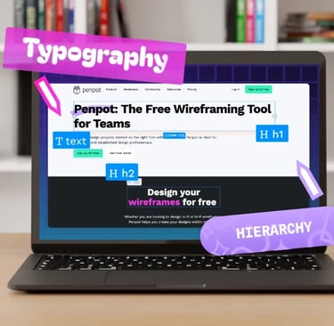
Typography and Hierarchy
How to guide your reader's eye with fonts and text weights
How to Guide Your Reader's Eye with Fonts and Text Weights
Great design isn't just about looking beautiful—it's about making information effortless to understand. One of the most powerful tools for achieving this is typography. The right combination of fonts and thoughtful use of text weights can transform a wall of text into a clear, engaging reading experience.
Typography creates hierarchy, and hierarchy tells readers where to look first, what matters most, and how different pieces of information relate to one another. When done well, readers move naturally through your content without even realizing they're being guided.
What Is Visual Hierarchy?
Visual hierarchy is the arrangement of elements that directs attention in a specific order. In typography, hierarchy is created through differences in size, weight, spacing, color, and font choice.
Think of a newspaper. Large headlines grab your attention first, followed by subheadings, body text, captions, and fine print. Each level serves a purpose, making the content easy to scan before readers commit to reading every word.
Without hierarchy, every piece of text competes for attention. The result is confusion and fatigue.
Start with a Font Pairing Strategy
One of the easiest ways to build hierarchy is by combining two complementary fonts.
A common approach is pairing:
A serif font for headings with a sans-serif font for body text.
A bold display font for titles with a clean, readable font for supporting content.
One font family using multiple weights for a simple, modern appearance.
The goal is contrast—not conflict. Fonts should feel different enough to establish hierarchy while still looking like they belong together.
If you're new to font pairing, remember that less is usually more. Two thoughtfully chosen fonts often outperform four or five competing typefaces.
Use Font Weight to Emphasize Importance
Font weight refers to the thickness of a typeface, ranging from Thin and Light to Regular, Medium, Bold, and Black.
Changing weight is one of the most effective ways to create emphasis without introducing unnecessary visual clutter.
For example:
Bold headings establish major sections.
Medium-weight subheadings introduce supporting topics.
Regular body text provides comfortable reading.
Light text works well for secondary information such as image captions or metadata.
Using weight consistently trains readers to recognize patterns, making your content easier to navigate.
Create a Clear Reading Path
Readers rarely consume content line by line from the very beginning. Instead, they scan.
Your typography should support that behavior by creating a natural reading flow.
A simple hierarchy might look like this:
Headline
Introduction
Section heading
Supporting paragraph
Highlighted quote or key statistic
Call-to-action
Each level should be visually distinct enough that readers instantly recognize where they are on the page.
Don't Rely on Size Alone
Many designers increase font size to create emphasis, but size works best when combined with other visual cues.
Instead of making every important heading dramatically larger, consider combining:
Larger font size
Increased font weight
Additional spacing above sections
Consistent alignment
Strategic use of color
These elements work together to create hierarchy without overwhelming the layout.
Make Scanning Easy
Online readers often spend only a few seconds deciding whether to continue reading. Strong typography helps them find what they're looking for quickly.
Improve scanability by:
Keeping headings short and descriptive.
Breaking long paragraphs into smaller sections.
Using bullet lists where appropriate.
Highlighting only truly important words.
Maintaining generous white space between sections.
The easier content is to scan, the more likely readers are to stay engaged.
Stay Consistent
Consistency is what makes hierarchy effective.
Choose a system for headings, subheadings, body text, and supporting content, then use it throughout your website or document.
For example:
H1: 40px Bold
H2: 30px Semi-Bold
H3: 24px Medium
Body: 18px Regular
Caption: 14px Light
Readers quickly learn this pattern, allowing them to navigate content with minimal effort.
Common Typography Mistakes
Even attractive fonts can lose their impact if they're used inconsistently. Watch out for these common mistakes:
Using too many font families.
Making every heading bold and oversized.
Mixing inconsistent spacing between sections.
Overusing italics or all caps.
Creating too little contrast between headings and body text.
A clean, restrained approach almost always produces a more polished result.
In Closing
Typography is more than selecting attractive fonts—it's about creating a visual roadmap for your audience. By pairing complementary typefaces, using font weights intentionally, and maintaining a consistent hierarchy, you help readers absorb information naturally and efficiently.
When typography is thoughtfully designed, readers don't have to work to understand your content. Their eyes instinctively know where to go next, allowing the message—not the layout—to take center stage.
Typography & Hierarchy