Whitespace Magic
The secret to cleaner, more effective design
The Secret to Cleaner, More Effective Design
When people think about great design, they often focus on colors, fonts, or eye-catching graphics. But one of the most powerful design tools isn't something you add—it's something you intentionally leave out.
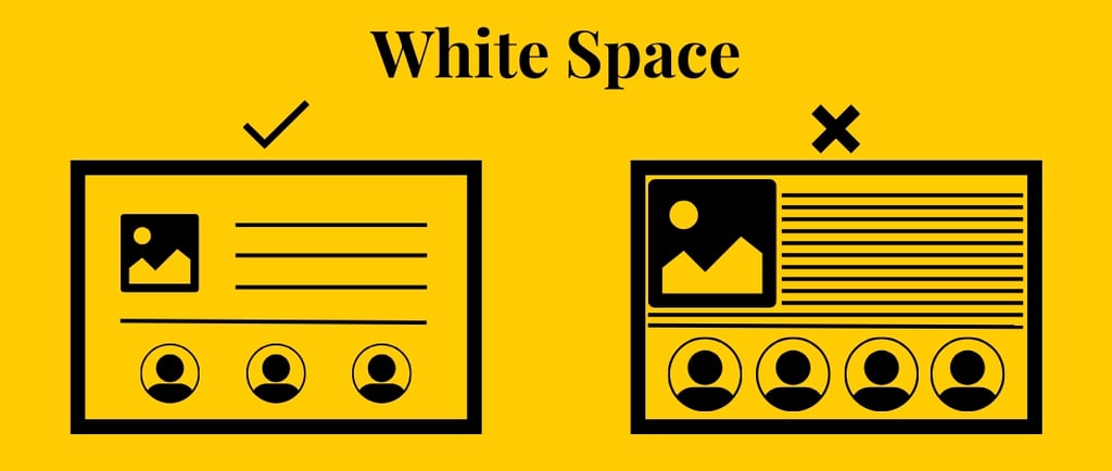
White space, also known as negative space, is the empty area between text, images, buttons, and other design elements. Far from being "wasted space," it's what gives your content room to breathe. Used well, white space transforms cluttered layouts into polished, professional designs that are easier to read, navigate, and enjoy.
What Is White Space?
White space doesn't have to be white. It can be any empty area in your design, regardless of background color or texture. It includes:
Margins around the edges of a page
Space between paragraphs
Padding around buttons and images
Gaps between sections
Line spacing between text
These intentional gaps help organize information and guide the viewer's attention naturally.
Why White Space Matters
1. It Improves Readability
Have you ever landed on a webpage packed with tiny text and crowded images? Chances are you clicked away within seconds.
Generous spacing makes content easier to scan and reduces mental fatigue. Readers can quickly identify headings, understand the structure of the page, and focus on the information that matters most.
2. It Reduces Visual Clutter
Trying to fit everything onto one page often has the opposite effect of what designers intend. Instead of showcasing every feature, overcrowding makes everything compete for attention.
White space creates separation between elements, allowing each one to stand on its own. The result feels cleaner, more organized, and more professional.
3. It Draws Attention to What Matters
Empty space naturally directs the eye.
Whether it's a call-to-action button, a product photo, or an important message, surrounding it with breathing room makes it more noticeable than placing it among competing elements.
Sometimes the fastest way to make something stand out isn't to make it bigger—it's to give it more space.
4. It Creates a Premium Feel
Many luxury brands rely heavily on white space because it communicates confidence and sophistication.
A spacious layout signals that every element has been carefully chosen. Instead of overwhelming visitors with information, it allows the design to feel calm, intentional, and trustworthy.
Common White Space Mistakes
Even experienced designers can fall into habits that create unnecessary clutter.
Watch out for:
Long blocks of uninterrupted text
Buttons placed too close together
Multiple fonts competing for attention
Too many images on one screen
Tiny margins around the edges of a page
Every inch filled with content
Remember, just because space is available doesn't mean it needs to be filled.
Practical Ways to Use White Space
Creating a cleaner design doesn't require starting from scratch. Small adjustments can make a big impact.
Break Up Large Paragraphs
Shorter paragraphs are easier to read, especially on mobile devices. Add spacing between sections to help readers process information more comfortably.
Increase Margins and Padding
Give text, images, and buttons room to breathe. Even adding 10–20 extra pixels of padding can dramatically improve a layout.
Group Related Content
Keep related items close together while leaving more space between different sections. This helps users understand which elements belong together.
Limit the Number of Elements
Ask yourself whether every graphic, icon, or block of text serves a purpose. Removing unnecessary elements often improves a design more than adding new ones.
Let One Element Shine
Instead of trying to highlight everything, choose one focal point. Surrounding it with white space naturally draws attention where you want it.
White Space Is a Design Decision
Some people worry that leaving empty areas makes a page feel unfinished. In reality, intentional white space is a hallmark of thoughtful design.
It improves readability, strengthens visual hierarchy, enhances user experience, and helps visitors focus on what's most important. Whether you're designing a website, presentation, flyer, or social media graphic, resisting the urge to fill every available inch often leads to better results.
White space isn't empty—it's working behind the scenes to make every other element more effective.
The next time you're tempted to squeeze in another image, paragraph, or button, pause and ask whether your design would actually be stronger with a little more breathing room.
Often, the difference between a cluttered layout and a polished one isn't adding more. It's knowing what to leave out.
White Space Magic: